How can websites possibly keep up with the millions of screens out there?
The short answer is they can’t. And never will be able to.
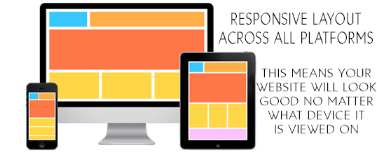
So how does a web page adapt responsively to the needs of a computer screen versus an iPad or Blackberry screen?
One of the best ways is through technique called responsive web design.
Responsive web design uses a separate set of files called CSS media queries to serve different style properties depending on the screen size, orientation, resolution, color ...
Continue Reading → Share