How can websites possibly keep up with the millions of screens out there?
The short answer is they can’t. And never will be able to.
So how does a web page adapt responsively to the needs of a computer screen versus an iPad or Blackberry screen?
One of the best ways is through technique called responsive web design.
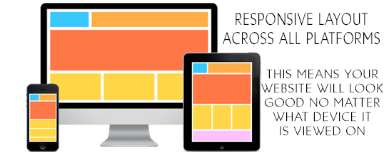
Responsive web design uses a separate set of files called CSS media queries to serve different style properties depending on the screen size, orientation, resolution, color capability and other characteristics of the user’s device.
Using the responsive web design approach, a web page can adjust itself on the device it’s being displayed on. Thus being fluid on most all devices that have internet access.
Share
About the Author: